 1 month ago
60
1 month ago
60
Which do you prefer?
![]()
Koreaboo
13 minutes ago
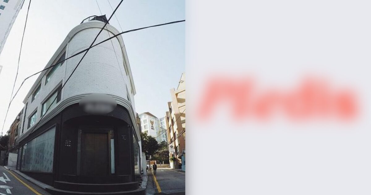
Recently, an online community post went viral regarding a K-pop agency.
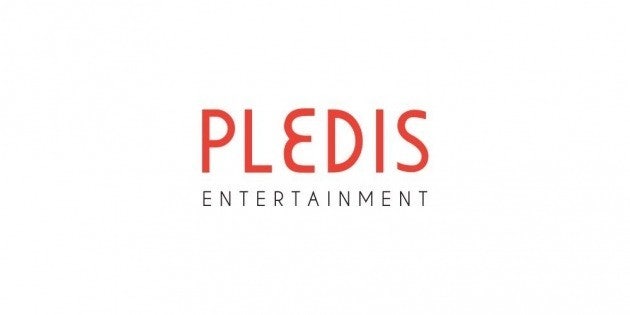
The post garnered over 55,000 views after netizens discovered that Pledis Entertainment received a whole makeover for the company’s logo design.
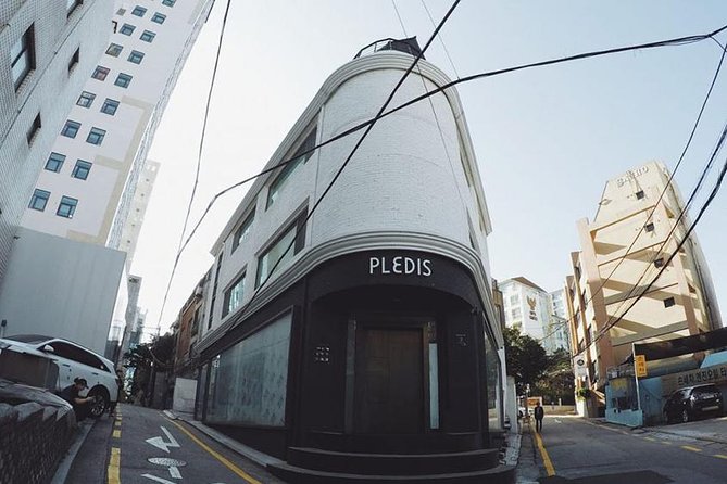
Pledis, which houses artists including SEVENTEEN and TWS, was founded in 2007.
Over the years, the company’s logo has become a signature design among fans because of its bright orange color.
The new logo design revealed a more trendy style and a brighter tone.
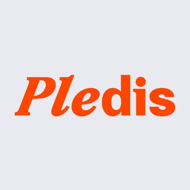
However, the new design triggered a divided response among netizens.
 | theqoo
 | theqoo
 | theqoo
- “The original was way better?”
- “Makes me want to eat donuts.”
- “It looks like a franchise restaurant.”
- “The old logo was prettier.”
- “Honestly, neither of them is it.”
- “The old logo is better if you had to choose.”
- “The new logo is better, but it’s not unique.”
- “It reminds me of a cosmetic brand like Peripera.”
- “The changed logo looks better.”


 English (US) ·